Growth is positive. Unemployment is low. Nasdaq is at a record. Corporate profits are rising. So why does the economy still feel wrong?
TL;DR
I do not think the data is lying. I think we keep asking it to answer questions it was never designed to answer. GDP measures production, not comfort. Inflation measures the speed of price changes, not whether prices went back down. Unemployment is a narrow labour-market category. A stock index is an asset-pricing machine, not a census. The world economy is still growing, but the gains are concentrated, the price level is permanently higher, good work is harder to reach, debt is expensive to carry, and war is redirecting money toward energy security, defence and reconstruction. The problem is not a clean global collapse. It is an economy that looks resilient in aggregate and feels expensive at the household level.
I keep seeing two versions of the same economy. On one screen, Nasdaq is at a record. U.S. corporate profits are near $4.8 trillion at an annual rate. Global unemployment is below 5 percent. On another screen, people are cutting rent with roommates, graduates are sending hundreds of applications, governments are refinancing debt at much higher rates, and oil is moving on every headline from the Gulf.
I do not think one screen is real and the other is propaganda. Both are real. They are simply measuring different layers of the system.
That distinction matters because the current debate often begins with the wrong question: if the data looks fine, why are people complaining? The more useful question is: what does each data point actually measure, and who does it describe?
The dashboard is not broken. We are reading the wrong gauges.
The dashboard is not broken
The headline dashboard for 2026 is surprisingly solid. The IMF expects the world economy to grow 3.0 percent this year and 3.4 percent next year. The ILO expects global unemployment to remain at 4.9 percent. The Federal Reserve is at 3.75-4.00 percent, the U.S. 10-year Treasury yield was 4.96 percent on September 22, and Nasdaq still managed to print another record high. [1][2][6][7][8]
| Indicator | Latest reading | What it actually tells us |
|---|---|---|
| Global real GDP growth | 3.0% (2026) | Total output is still expanding |
| Global headline inflation | 4.7% (2026) | The price level is still rising |
| Global unemployment | 4.9% / 186m | Strict unemployment remains low |
| Nasdaq Composite | 27,212.68 intraday record | Large listed tech-heavy firms are highly valued |
| Fed funds target | 3.75-4.00% | Short-term money is expensive again |
| U.S. 10-year Treasury | 4.96% | Long-term capital has a high hurdle rate |
| U.S. corporate profits | $4.83T annual rate | Corporate America is still very profitable |
Latest available data as of September 23, 2026. Sources: IMF, ILO, Federal Reserve, U.S. Treasury, Reuters, BEA. See references.
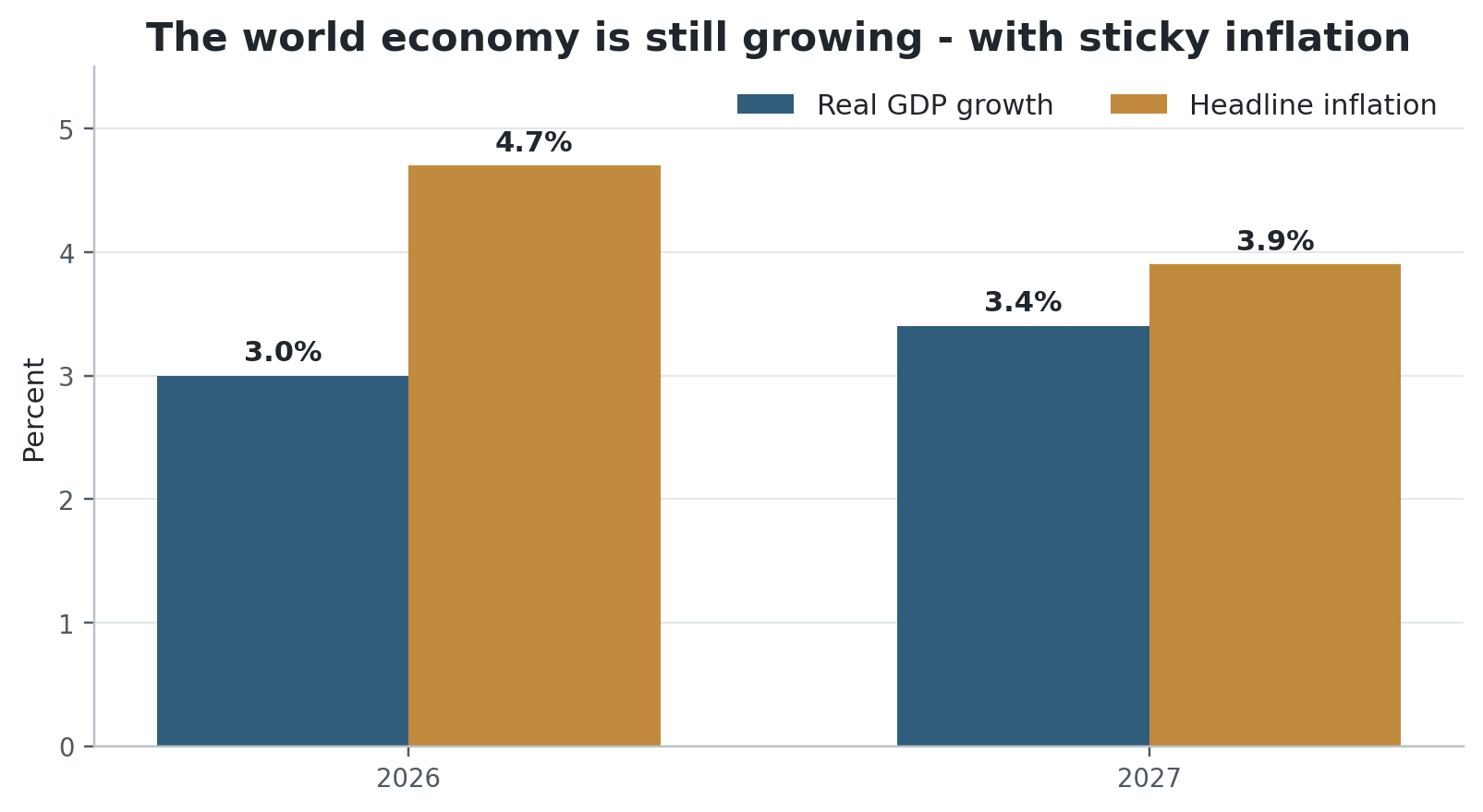
Figure 1. IMF July 2026 projections. Source: IMF World Economic Outlook Update, July 2026 [1].
This is why I would not describe the world economy as being in a normal recession. Output is growing. Firms are making money. Labour markets have not collapsed. The problem starts when we mistake resilience for broad comfort.
Inflation went down. Prices did not.
This is probably the simplest reason people distrust the macro story. Economists say inflation is lower, and households hear that as prices should be lower. But inflation is a rate of change. A lower inflation rate means prices are rising more slowly. It does not rewind the price level.
The U.S. CPI averaged 258.8 in 2020. By August 2026 it was 335.0. On the same index, that is roughly a 29.4 percent increase in the price level. August inflation was 3.4 percent year over year, which sounds much calmer than 2022, but the household is still paying on top of the entire earlier jump. [4]
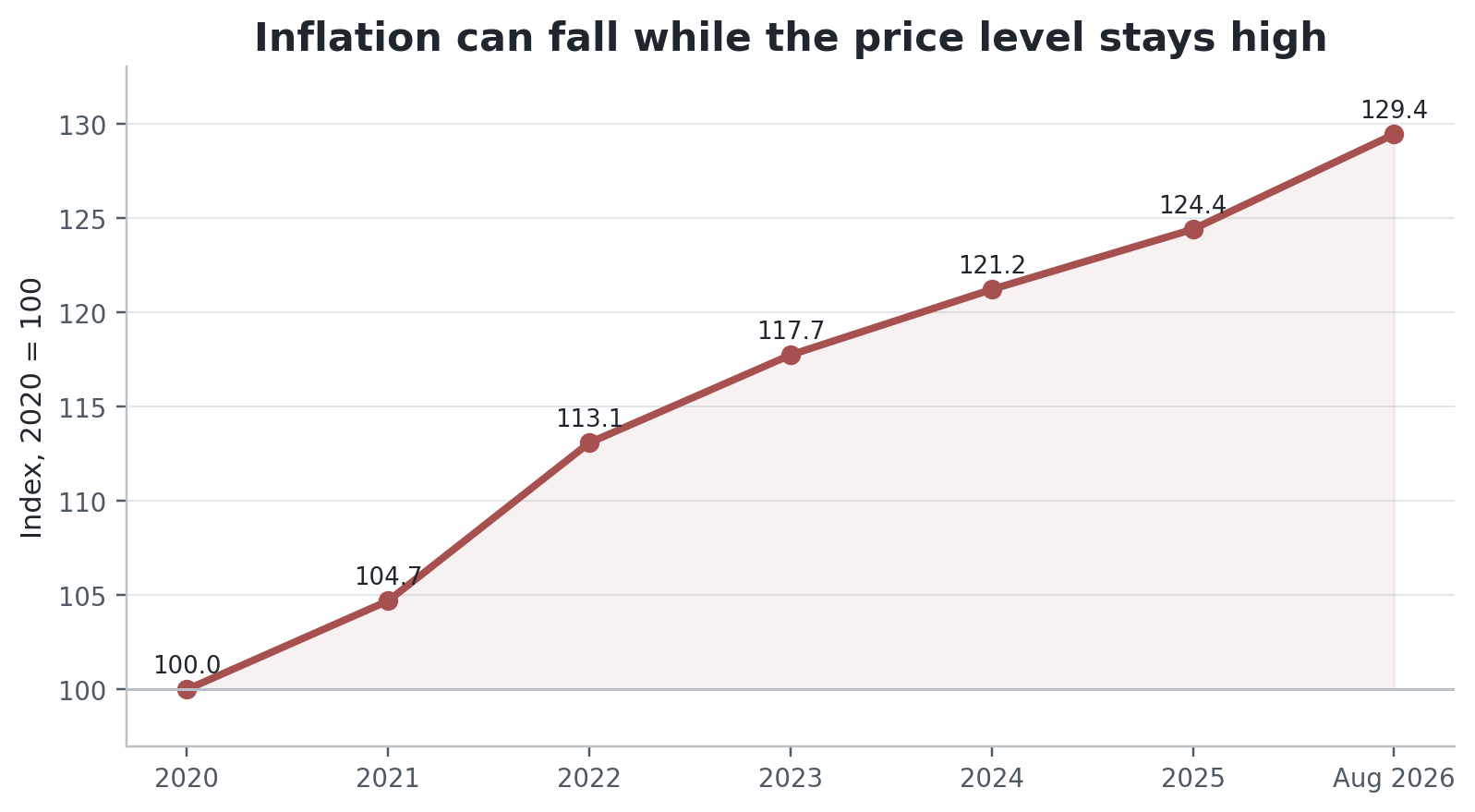
Figure 2. U.S. CPI-U, indexed to 2020 = 100; 2026 point is August. The cumulative rise is about 29.4%. Source: U.S. Bureau of Labor Statistics [4].
This is why a person can hear ‘inflation is under control’ while the supermarket, rent, insurance and energy bill still feel expensive. The slope has changed. The altitude has not.
It also explains why wage recovery takes so long. A nominal raise can be real progress and still fail to restore the purchasing power lost during the earlier price shock. The memory of inflation lives in the level of prices, not in this month’s percentage change.
Low unemployment is not the same thing as good work.
The second misread is unemployment. The ILO projects global unemployment at 4.9 percent in 2026, about 186 million people. That is a genuinely resilient number. But the same report estimates a broader jobs gap of 408 million people — people who want paid work but cannot access it. It also estimates 2.1 billion workers in informal employment and nearly 300 million workers in extreme working poverty. [2]
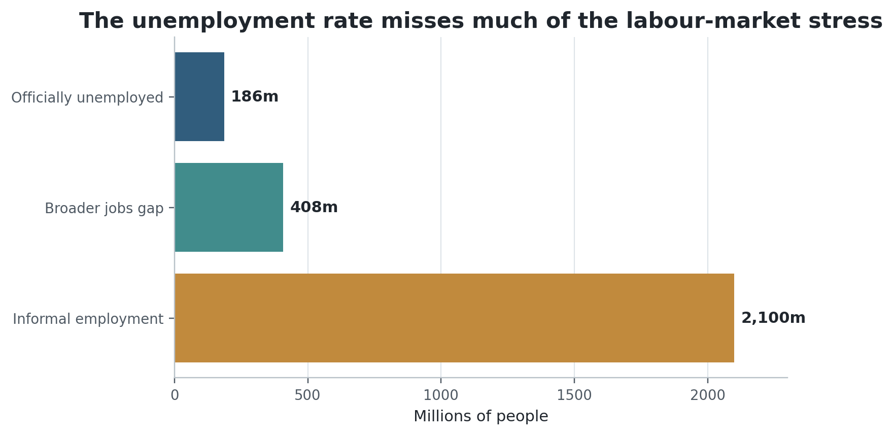
Figure 3. Different labour-market measures answer different questions; categories are not additive and informal workers are employed. Source: ILO Employment and Social Trends 2026 [2].
That is the labour-market version of the same problem. The headline statistic is not false. It is narrow.
A person can be employed and still have unstable hours, weak bargaining power, no social protection, no path to promotion, or wages that do not cover housing. A graduate can stop being counted as unemployed by taking a job far below the skill level they trained for. A delivery rider can be technically employed while carrying most of the risk of the business on their own balance sheet.
The OECD gives the same message from a richer-country angle. In the first quarter of 2026, real wages were still below their Q1 2021 level in 13 of the 37 countries it analysed. Average real-wage growth was positive, but the recovery was slowing. [3]
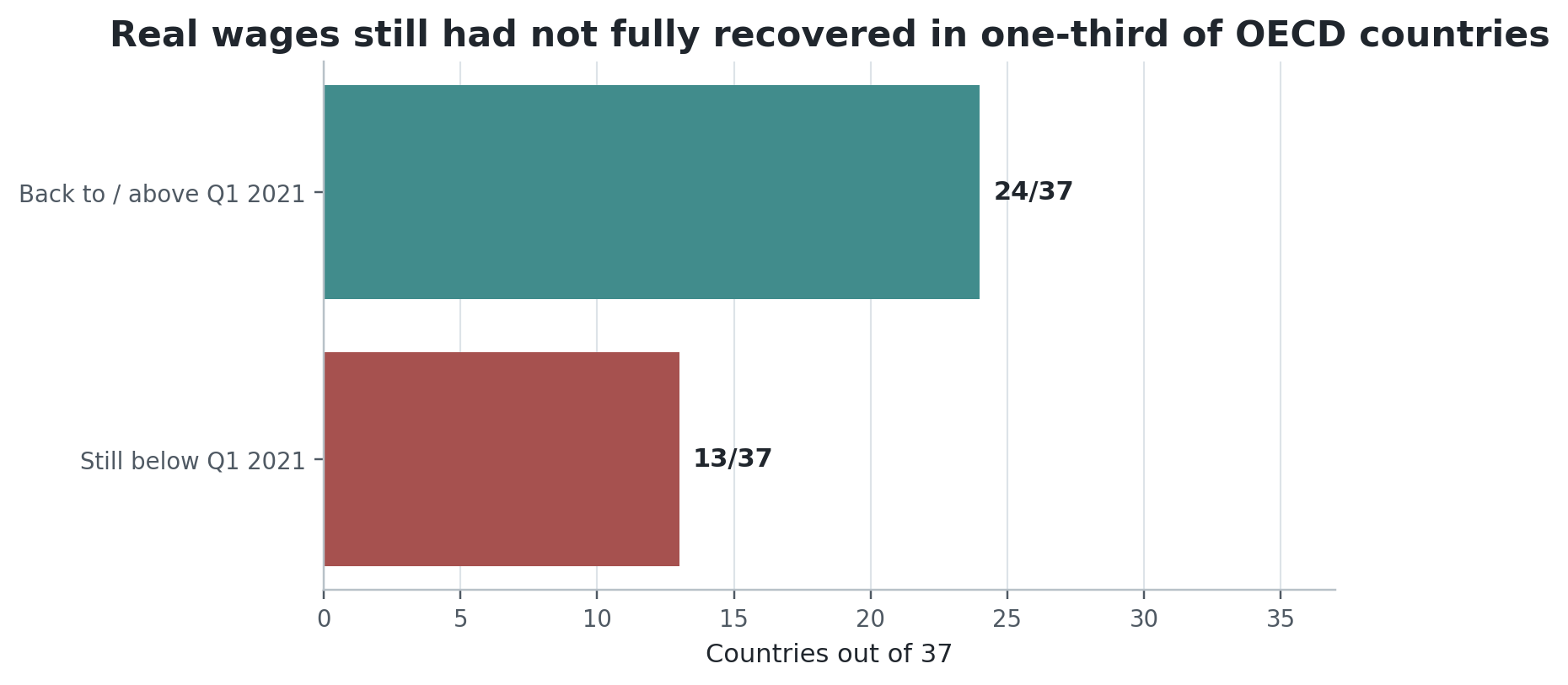
Figure 4. Real wages in Q1 2026 versus Q1 2021 across 37 OECD countries. Source: OECD Employment Outlook 2026 [3].
So when somebody says ‘I cannot find a decent job’ and the unemployment rate says ’the labour market is fine,’ I would not choose one and discard the other. They are describing different thresholds of success.
The stock market is not a census.
The third misread is probably the most visible one: Nasdaq at an all-time high while everyone keeps talking about expensive money.
On September 22, Nasdaq reached an intraday record of 27,212.68. At almost the same time, the U.S. 10-year Treasury yield was 4.96 percent and the Federal Reserve’s target range was 3.75-4.00 percent. That is not cheap money. The rally has been carried by strong earnings, AI-linked capital spending and renewed confidence that large technology firms can turn enormous infrastructure investment into cash flow. [6][7][8]
The important point is that the stock market does not measure the median household. It discounts expected cash flows of listed companies, weighted heavily toward the biggest firms. If a handful of very large companies earn more and receive higher valuations, the index can rise even if a large number of households are under pressure.
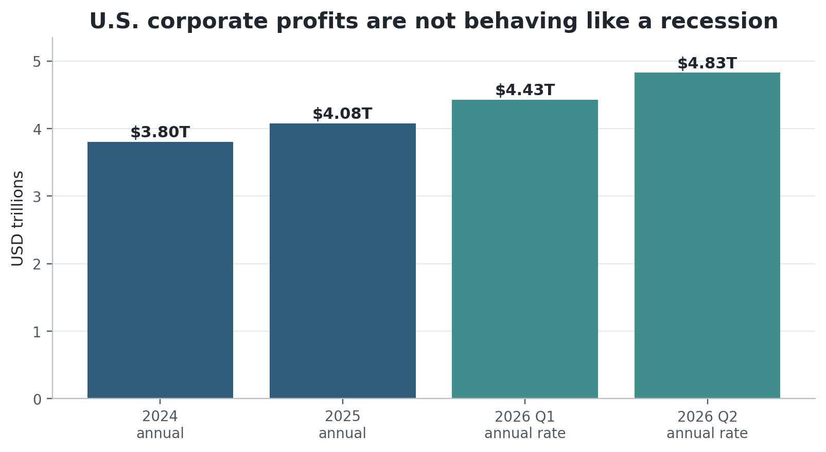
Figure 5. U.S. corporate profits from current production. Quarterly figures are shown at annual rates. Source: U.S. Bureau of Economic Analysis [5].
The profit side of the story is real. BEA reports U.S. corporate profits from current production at $4.827 trillion in Q2 2026 at an annual rate, up from $4.427 trillion in Q1. [5]
But ownership is not evenly distributed. Federal Reserve Distributional Financial Accounts show that the top 10 percent of U.S. households by wealth owned about 88 percent of corporate equities and mutual fund shares in Q2 2026. The bottom 50 percent owned about 0.6 percent. [9]
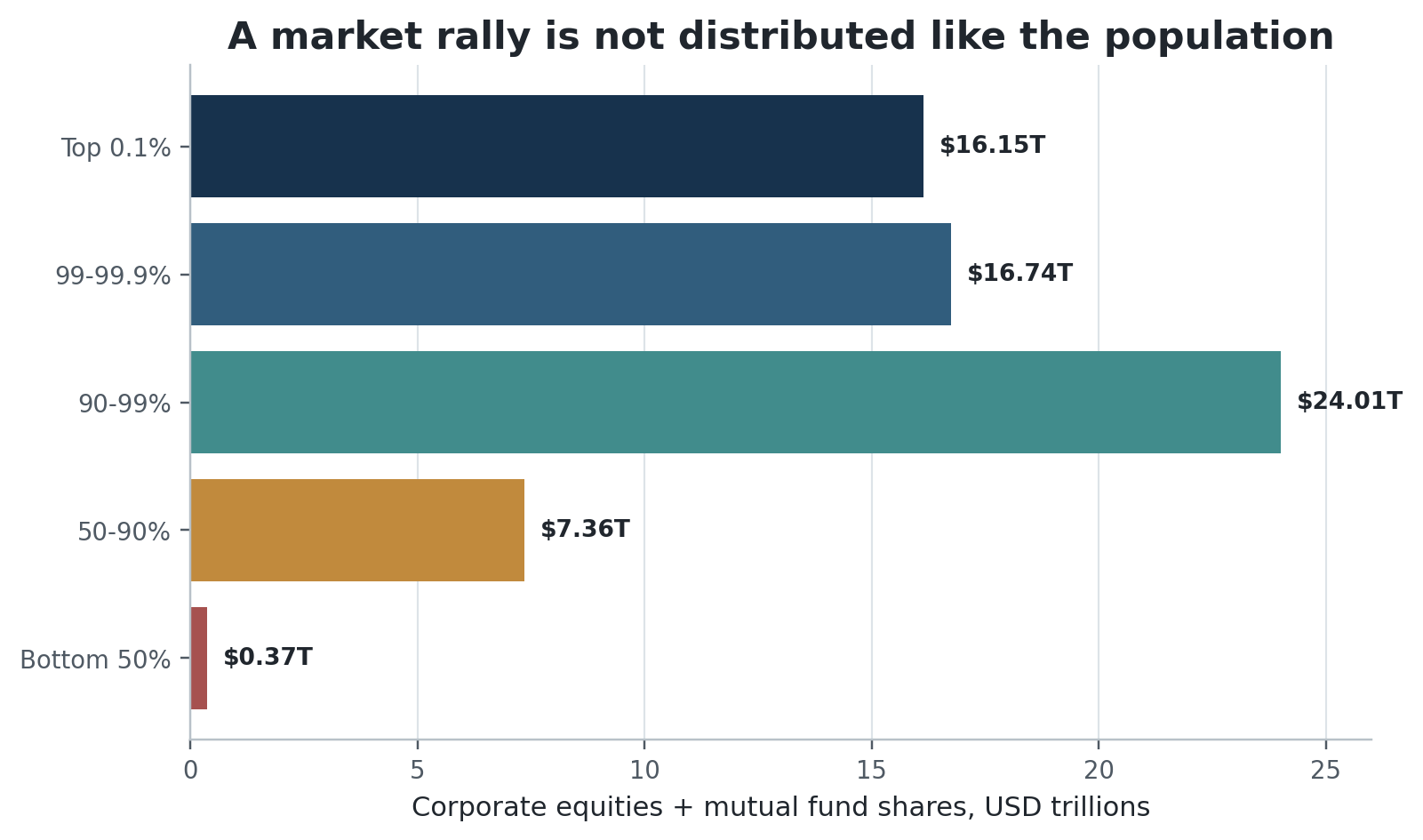
Figure 6. Corporate equities and mutual fund shares by U.S. wealth percentile, 2026 Q2. Source: Federal Reserve Distributional Financial Accounts [9].
That makes the Bugatti-versus-rent image less mysterious. When asset prices rise, the gains are distributed through an ownership structure that is already unequal. A market boom can make the aggregate household sector richer while doing almost nothing for the household that owns no meaningful financial assets.
This is also why I dislike the phrase ’the economy is the stock market’ almost as much as its opposite. The market is real. It finances firms, affects pensions, sets the cost of equity and changes wealth. It is just not a representative sample of daily life.
High rates split the economy before they slow it.
High interest rates do not hit everybody in the same direction. A cash-rich household can earn more on deposits and short-term bonds. A leveraged household refinancing a mortgage, carrying credit-card debt or financing a car pays more. A profitable mega-cap can fund investment internally. A smaller company that needs a bank loan gets the full rate shock.
That is why the same monetary policy can make one balance sheet safer and another one fragile.
The global version is public debt. IMF data put global public debt just under 94 percent of GDP in 2025 and project it to reach 100 percent by 2029. Interest spending has risen from about 2 percent to nearly 3 percent of global GDP in only four years as old debt gets refinanced at today’s rates. [10]
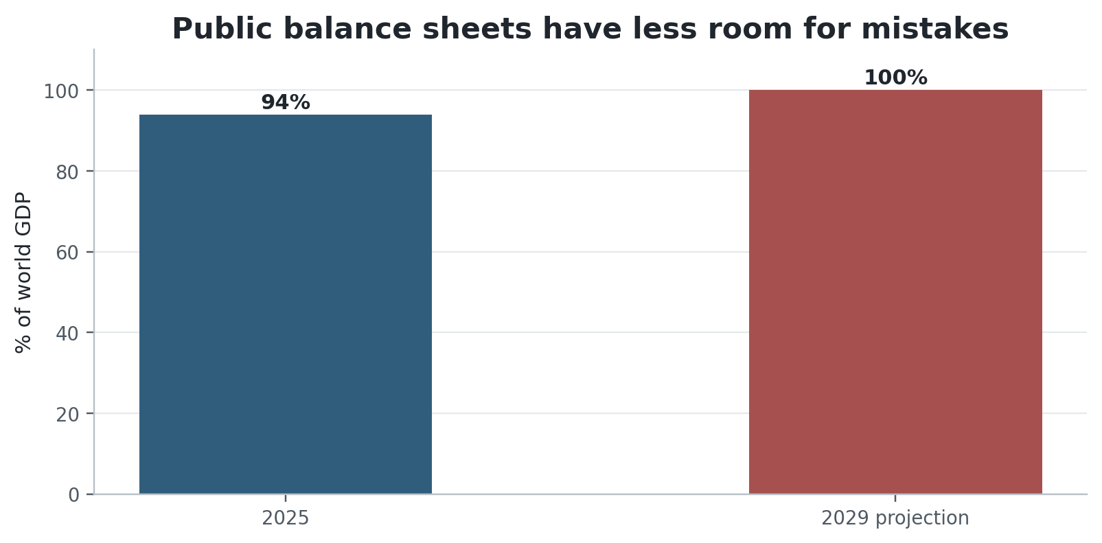
Figure 7. Global public debt. 2029 is an IMF projection. Source: IMF Fiscal Monitor, April 2026 [10].
This is not automatically a debt crisis. It is a loss of room. Governments have to pay for ageing, social protection, climate adaptation, defence and infrastructure while a larger share of revenue goes to interest. A household has the same problem when the minimum payment grows: the first effect is not bankruptcy. It is less freedom in everything else.
The New York Fed’s Q2 2026 data are useful here because they keep the story honest. U.S. household debt was $18.8 trillion and 4.7 percent of outstanding debt was in some stage of delinquency, but aggregate delinquency actually improved slightly. [11] This is not 2008 repeating on schedule. The system can stay solvent while still feeling expensive.
War makes the national accounts look stranger.
War adds another reason the data can look better than life feels. GDP is a measure of production. It is not a welfare balance sheet. If a government buys more military equipment, that production enters GDP. If destroyed infrastructure is rebuilt, the rebuilding enters GDP too. The loss of security, the destruction of existing wealth, displacement and the value of a normal life do not appear in the headline with equal symmetry.
This is not an argument that defence spending is ‘fake GDP.’ It is real production purchased for a real security purpose. It is an argument about what the statistic is designed to measure.
SIPRI estimates that world military expenditure reached $2.887 trillion in 2025, the eleventh consecutive annual increase and the highest level in its series. Europe increased military spending 14 percent in real terms in 2025 as the Russia-Ukraine war continued and European states accelerated rearmament. Russia spent an estimated $190 billion; Ukraine $84.1 billion. [12]
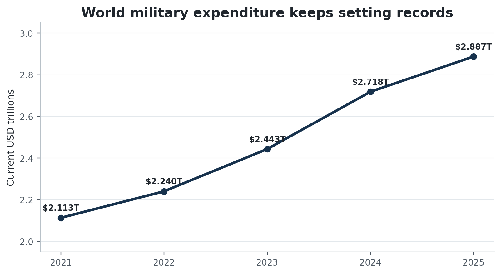
Figure 8. World military expenditure, current U.S. dollars. Source: SIPRI Military Expenditure Database and annual releases [12].
That spending can support factories, employment and measured output. But it also represents resources that cannot simultaneously build housing, rail, schools or productive civilian capacity. The economic question is not whether security has value. Obviously it does. The point is that aggregate GDP can rise while the opportunity cost rises with it.
The human balance sheet is even further away from a market index. UNHCR counted 117.8 million forcibly displaced people at the end of 2025. That was down from 123.2 million in 2024, the first annual decline in a decade, but still dramatically above the 78.4 million recorded in 2019. [13]
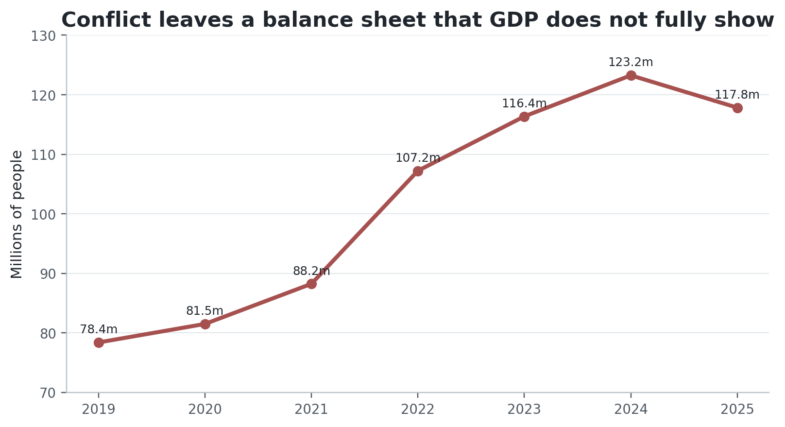
Figure 9. People forcibly displaced worldwide at year-end. Source: UNHCR Global Trends 2025 [13].
Gaza gives a concrete example of the difference between flow data and destroyed wealth. A joint EU-UN assessment prepared with the World Bank estimated $35.2 billion in physical damage, $22.7 billion in economic and social losses, and $71.4 billion in recovery and reconstruction needs over the coming decade. [14]
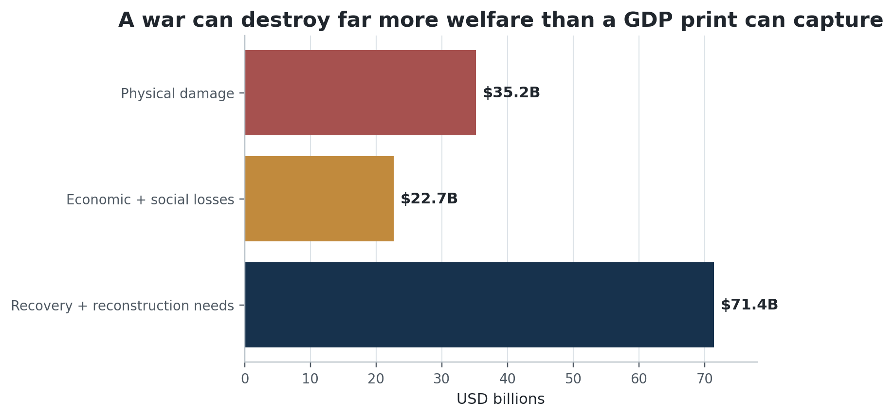
Figure 10. Gaza Rapid Damage and Needs Assessment, April 2026. Source: EU-UN assessment with World Bank coordination [14].
The current Middle East conflict is also a reminder that war travels through prices long before it reaches GDP tables. In September, commercial traffic through the Strait of Hormuz fell sharply below its recent average as fighting intensified, while Brent crude traded above $100 per barrel. The IMF’s July update describes the same macro tension: war is weighing on energy importers while AI-linked investment is lifting economies plugged into the technology cycle. [1][15]
That sentence is almost the 2026 world economy in miniature. One shock raises transport, energy and financing costs. Another raises investment, profits and market capitalisation. The aggregate can look stable because the forces partly offset each other. The people exposed to each force are not the same people.
AI can strengthen the aggregate and weaken the entry point.
AI makes the split sharper because it is both a productivity story and a distribution story.
The upside is easy to see. Data centres, semiconductors, power equipment, cloud infrastructure and software are producing a large investment cycle. The IMF explicitly says technology momentum is offsetting part of the drag from war in its 2026 global forecast. [1] That is one reason corporate earnings and market indices can remain strong even with expensive capital.
The harder part is the labour market. The ILO does not forecast a simple mass-unemployment event, and I do not think that is the right frame either. The more immediate risk is that the bottom rung of some white-collar careers gets thinner. If a junior analyst, designer, programmer or researcher can produce twice as much with AI, the firm may still grow while hiring fewer beginners for the same output.
That is a great productivity story for the firm and a terrible first-job story for the person trying to enter. Again, both can be true.
So what is actually wrong?
For me, the problem is not one hidden recession. It is six smaller problems stacked on top of each other.
- A price-level problem. Inflation has slowed, but households still live at the new, higher level of prices.
- A distribution problem. Asset gains and corporate profits accrue disproportionately to people who already own capital.
- A work-quality problem. Low unemployment can coexist with informality, underemployment, weak entry-level hiring and wages that have not fully recovered.
- A financing problem. High rates reward liquidity and punish leverage, which divides households, firms and governments by balance-sheet strength.
- A concentration problem. A small set of technology firms and AI-linked sectors can lift broad indices even when the rest of the economy is less spectacular.
- A geopolitical allocation problem. War, energy security, defence and reconstruction absorb money and productive capacity while adding risk to trade routes and prices.
None of those requires GDP to be negative. None requires unemployment to hit 10 percent. None requires the stock market to crash. That is exactly why the current economy is psychologically confusing: our favourite crisis indicators were built to identify collapse, not uneven resilience.
What I do with this diagnosis
I would not respond to this by trying to predict the exact month of a crash. The boring balance-sheet decisions are more useful than the dramatic forecast.
- Keep liquidity. A cash buffer buys time when the labour market is slow or an income source disappears.
- Treat expensive debt as a guaranteed negative return. Variable-rate and consumer debt become especially dangerous when capital stays expensive.
- Do not confuse an all-time high with low risk. Diversification matters more when market leadership is concentrated.
- Own productive assets if you can, but do not finance them with leverage you cannot survive through a drawdown.
- Keep fixed costs boring. A higher portfolio value is reversible; a permanently higher lifestyle is not.
- Invest in skills that make you complementary to technology. The safest career position is rarely doing the exact task that software is learning to automate.
I think this is the useful middle ground between two bad narratives. One says everything is fine because the headline data is fine. The other says the system must be moments from collapse because ordinary life feels expensive. I do not think either is accurate.
The averages are healthy. The distribution is not.
The world economy does not look sick in the way a normal recession looks sick. That is the point.
It looks successful in averages and expensive in lived experience. Growth is positive. Profits are strong. Markets can make records. At the same time, the price level is high, good work is uneven, borrowing costs are punishing, asset ownership is concentrated, and wars are rerouting resources through defence, energy and reconstruction.
The data looks good because a large part of the system is working. People feel that something is wrong because the parts they interact with every week — housing, wages, job searches, credit, food, energy and fixed costs — are where much of the adjustment is concentrated.
Both observations can be true. For me, that is the real answer.
Data notes
Figures use the latest data available as of September 23, 2026. Forecasts are labelled as forecasts. Different indicators have different populations and definitions; the labour-market measures in Figure 3 overlap and should not be added together. The stock-wealth chart describes U.S. household ownership, not global wealth. U.S. corporate-profit quarterly figures are annual rates. Military spending is reported by SIPRI in current U.S. dollars for the plotted totals; its year-over-year growth rates are stated in real terms in SIPRI publications.
References
- International Monetary Fund. World Economic Outlook Update, July 2026: Global Economy in Crosscurrents of War and Technology.
- International Labour Organization. Employment and Social Trends 2026.
- OECD. OECD Employment Outlook 2026, Chapter 1: From resilience to risk — employment and wages under pressure.
- U.S. Bureau of Labor Statistics. CPI-U historical annual averages and August 2026 CPI release.
- U.S. Bureau of Economic Analysis. Corporate Profits.
- Federal Reserve Board. Open Market Operations — federal funds target range history.
- U.S. Department of the Treasury. Daily Treasury Par Yield Curve Rates, September 2026.
- Reuters. Nasdaq hits intraday record high as tech stocks regain footing, September 22, 2026.
- Federal Reserve Board. Distributional Financial Accounts, 2026 Q2.
- International Monetary Fund. Fiscal Monitor, April 2026: Fiscal Policy under Pressure — High Debt, Rising Risks.
- Federal Reserve Bank of New York. Quarterly Report on Household Debt and Credit, Q2 2026.
- Stockholm International Peace Research Institute. Trends in World Military Expenditure, 2025.
- UNHCR. Figures at a Glance / Global Trends 2025.
- European Union and United Nations, coordinated with the World Bank. Gaza Rapid Damage and Needs Assessment, April 2026.
- Reuters. Shipping traffic through the Strait of Hormuz, September 17-20, 2026.
Prepared for publication. Charts are original visualisations built from the cited public data sources.